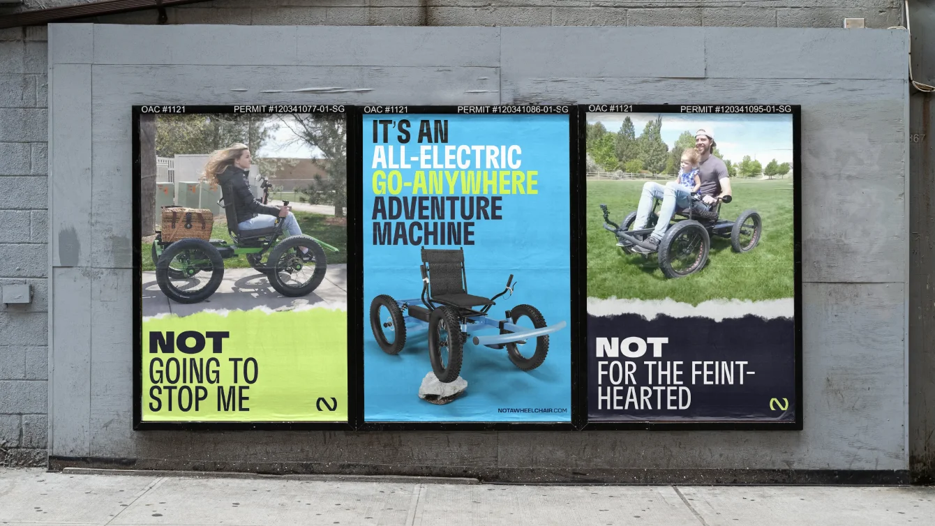
A powerful new identity for an accessible mobility movement

Tags: Identity, Digital and Motion

Client: Not A Wheelchair (un-used concept)

Situation

The Rig is an amazing idea with huge potential to improve the lives of those with physical disabilities, but the Not A Wheelchair brand doesn't do justice to the product. It lacks refinement and struggles to communicate the team's vision effectively. It’s in need of a refresh to help the Rig reach even more people who could benefit from an affordable, easy-to-use, electric, off-road transportation solution.
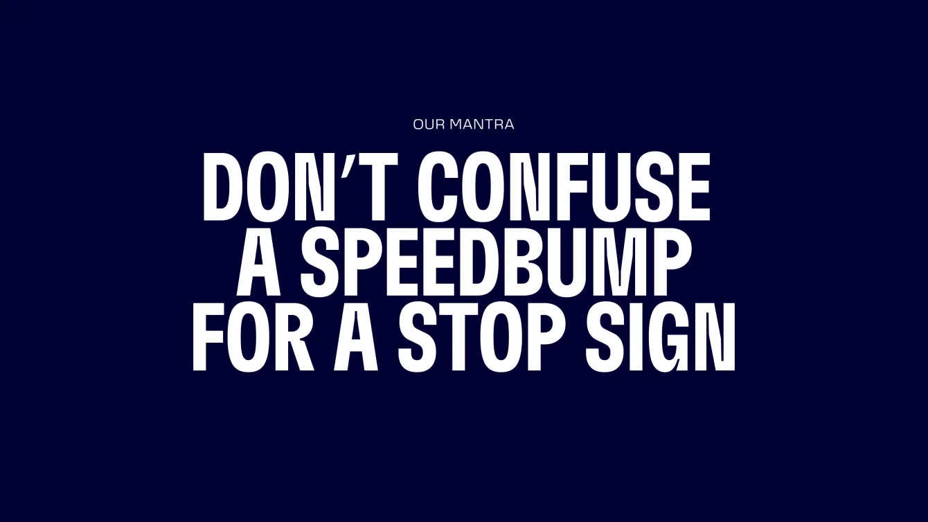
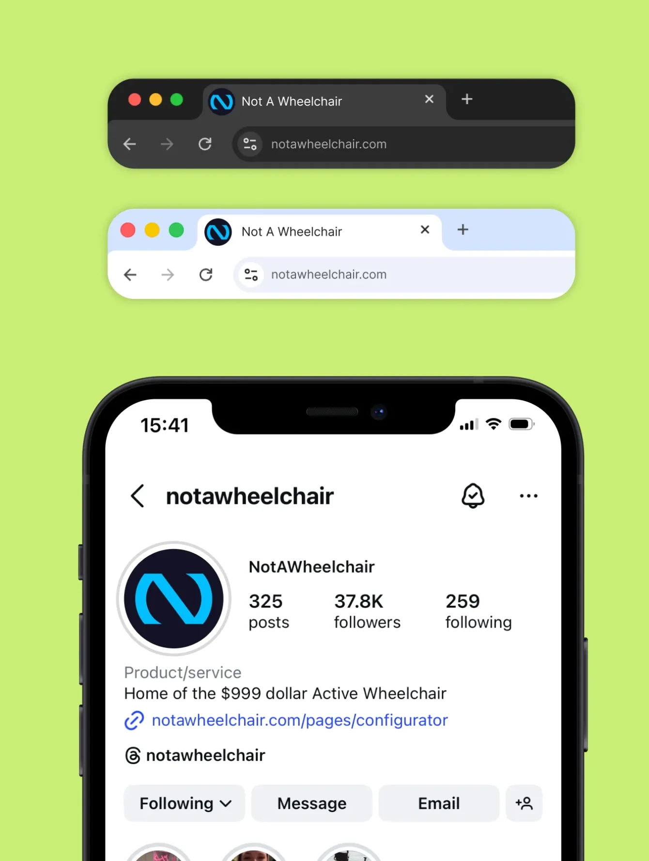
Solution

I've re-imagined the brand with a fresh new identity, including logo, colours, fonts, imagery and messaging, that works across print, web and social. The new brand identity builds upon the story so far and provides a cohesive graphic language making it easier to create a wide range of communications that are engaging, accessible and memorable for the journey ahead.

Artboard 27_result.webp
Artboard 15_result.webp

Finding clarity

Uncovering a powerful driving force

At the heart of Not A Wheelchair is a simple but powerful mantra that captures their spirit of resilience, optimism and the drive to keep moving forward, no matter the obstacles. This idea became the foundation for the visual identity. The result is a brand that embodies momentum and possibility, just like the people it’s built for.

NAW-Social_min.webp
NAW-Icon_min.webp

Creative

Building an identity system

With the core idea in place, the focus shifted to building a flexible identity system that could live comfortably in both digital and physical spaces. From social content and web pages to out-of-home materials, the brand needs to feel consistent without becoming repetitive.

The system is designed to adapt to the brand’s voice, bold and energetic when it needs to make a statement, quieter and more considered when clarity matters most. This flexibility gives the team the freedom to communicate in different ways while always on brand.

Creative

Building the rig

To bring the product to life, we created a detailed 3D visualisation of The Rig. This gave us the freedom to craft bold, dynamic compositions, from striking hero shots and intimate close-ups to animated sequences that show the product in motion.

The process started with modelling The Rig in 3D, followed by carefully refining the geometry, applying realistic materials and lighting, and building in articulation. By rigging the model, we were able to control individual components and pose The Rig, creating images and videos that feel purposeful, expressive and true to the product.


Up next

Powering zero emissions logistics

Identity, Digital and Brand for Zhero