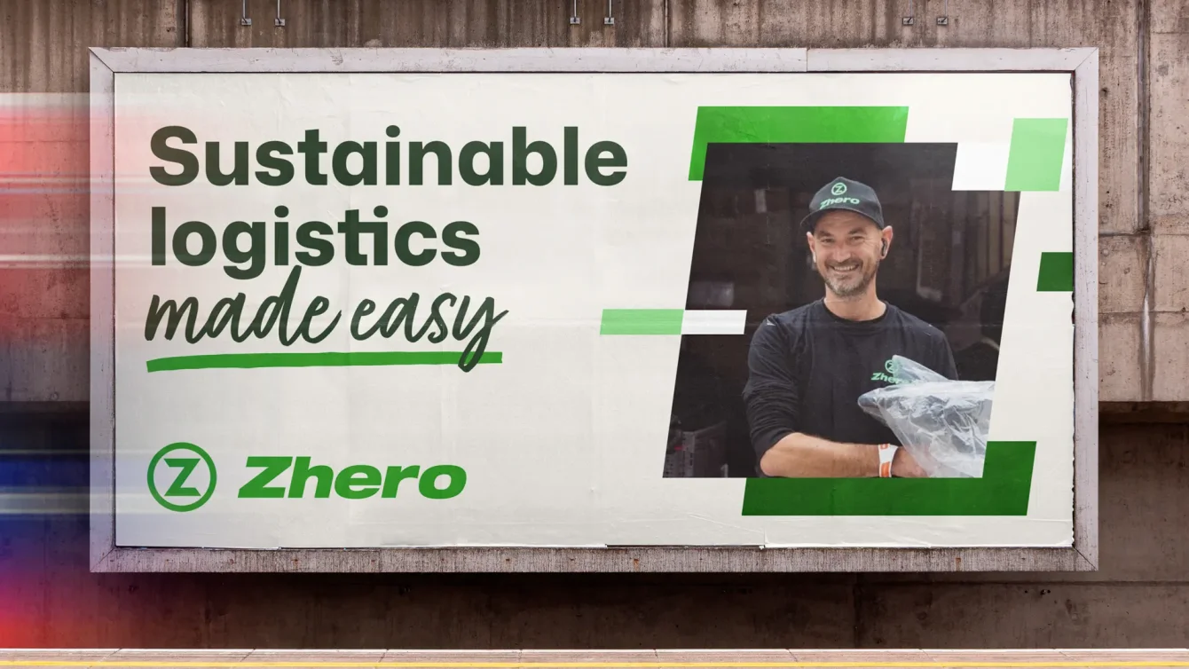
Brand strategy and identity system for a carbon free movement

Tags: Identity, Digital and Brand

Client: Zhero

Situation

In 2019, Zhero started building a delivery service that’s sustainable from the ground up. With a growing fleet of electric cargo bikes and vans, they help businesses move their supplies nationwide with zero emissions. Zhero have seen impressive success, but their bare bones brand had been with them since day one, so it was time for a refresh that reflected the quality, values, and ambition behind the operation.

Solution

We started with a full brand audit to understand Zhero from the inside out. By speaking directly with the founders, riders, drivers, and clients, we built a clear picture of how the brand was experienced. From there, we developed a refreshed visual identity designed to elevate Zhero’s presence, improve accessibility, and double down on what makes them different.
Zhero

Research and strategy

Getting to know Zhero

Like many fast-growing businesses, Zhero’s marketing had taken a back seat while the team focused on doing the work, most days spent out on the road, not behind a desk. To get a fresh and honest view, we began with an in-depth research and discovery phase.

We ran interactive workshops with founders Ollie and Joe, the wider team of riders and drivers, and a select group of clients and external stakeholders. These sessions helped surface shared beliefs, unspoken frustrations, and the values that truly sit at the heart of Zhero, giving us a strong foundation to build from.

Creative

Developing the logo

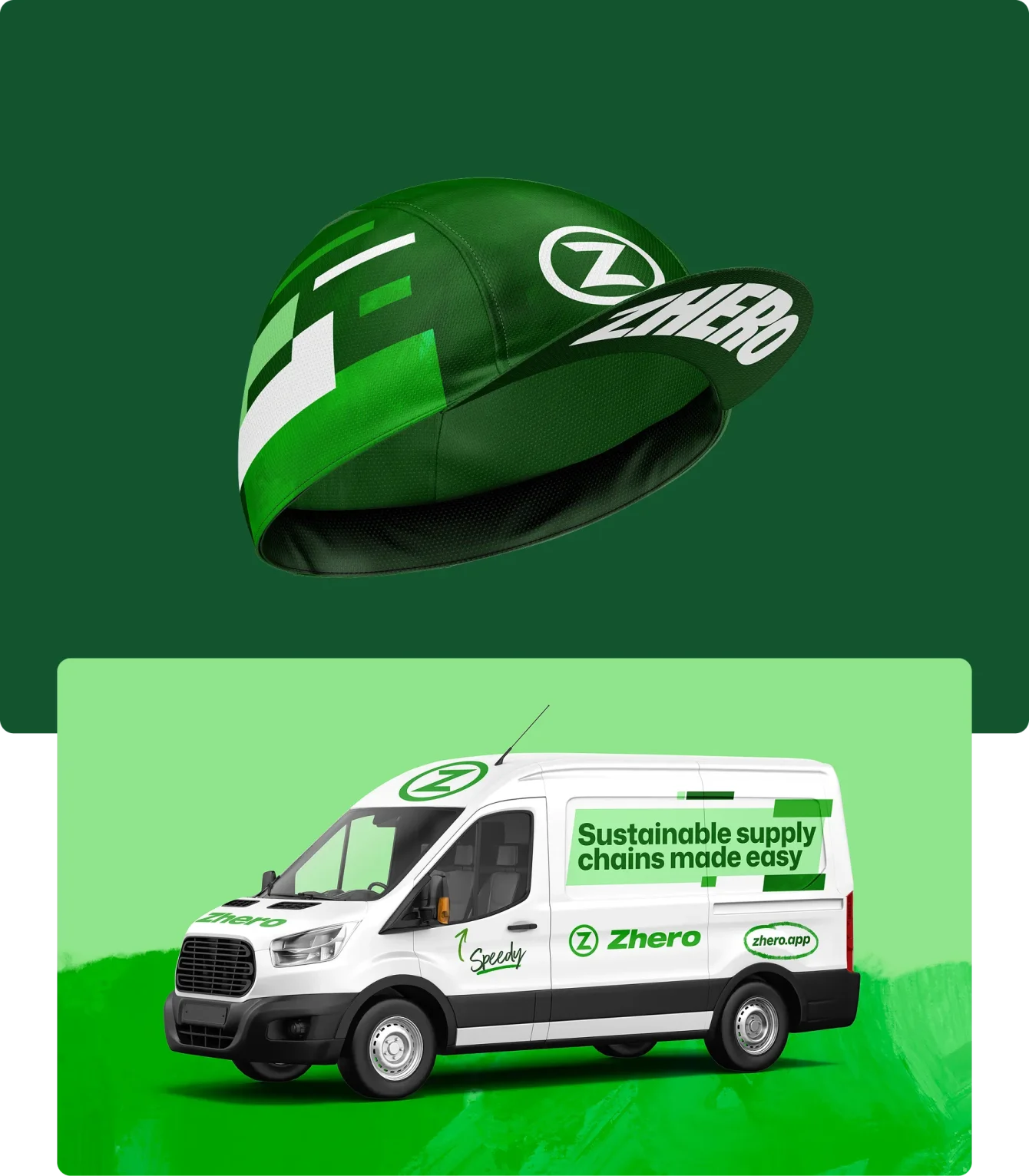
Zhero’s logo does a lot of heavy lifting. It appears prominently across their vehicle livery, making it one of the most visible parts of the brand. That meant any changes needed to be considered, purposeful, and built to last. We presented three routes, ranging from subtle evolution to more radical change, each testing different ways the logo could work harder for the brand.

zhero-casestudy-01_min.webp

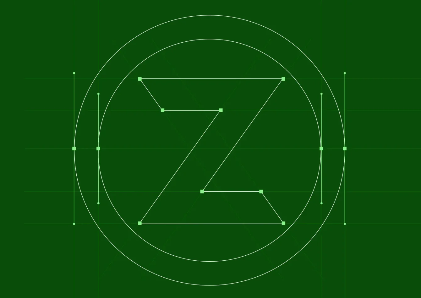
In the end, the answer wasn’t to start again. By returning to the original logo with fresh eyes, we were able to refine and strengthen what was already there. We applied simple visual principles to balance the forms and create a mark that feels more confident, and characterful without losing the equity it had already built.

zhero-casestudy-02_min.webp

Creative

Expanding the visual system

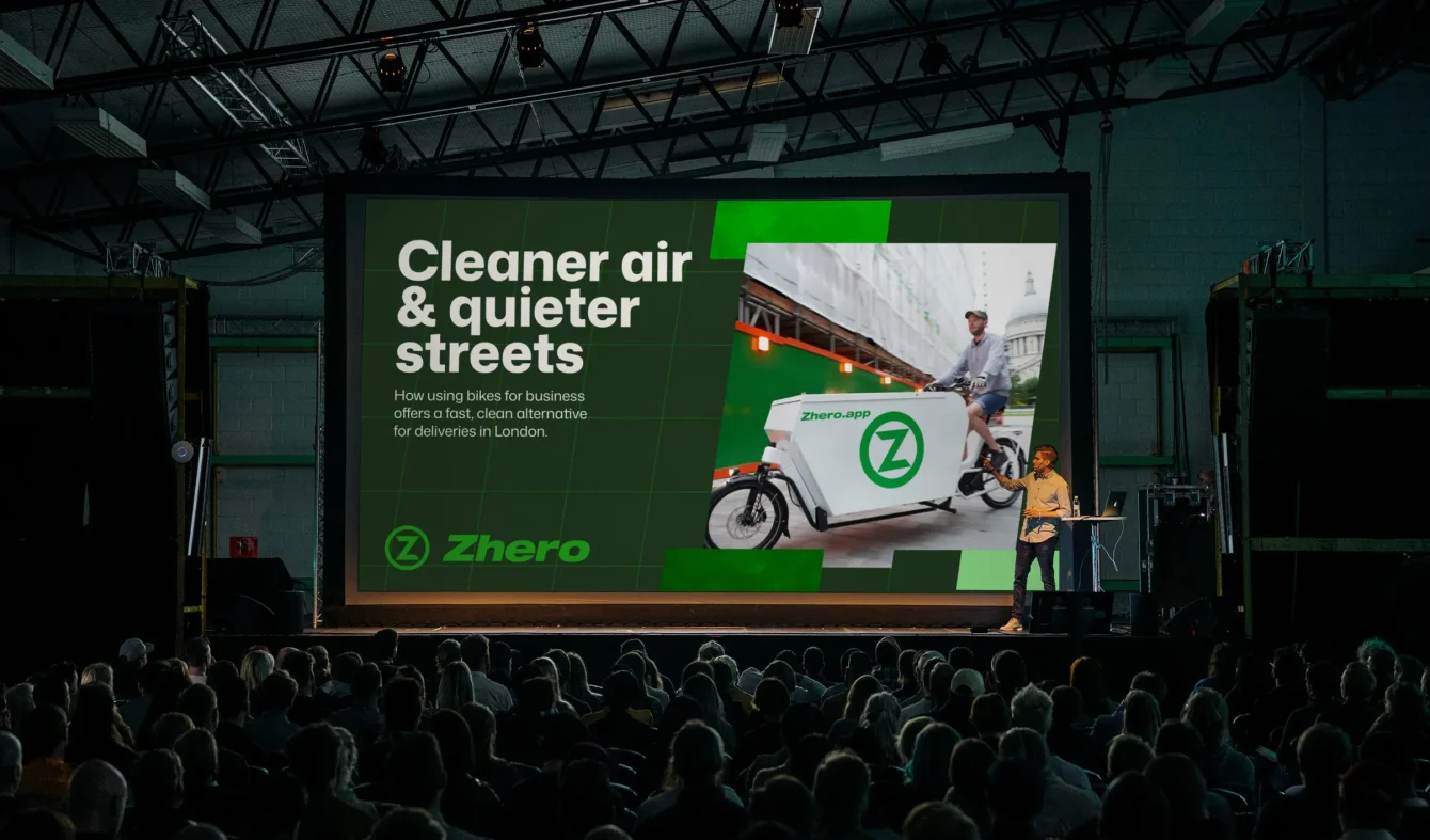
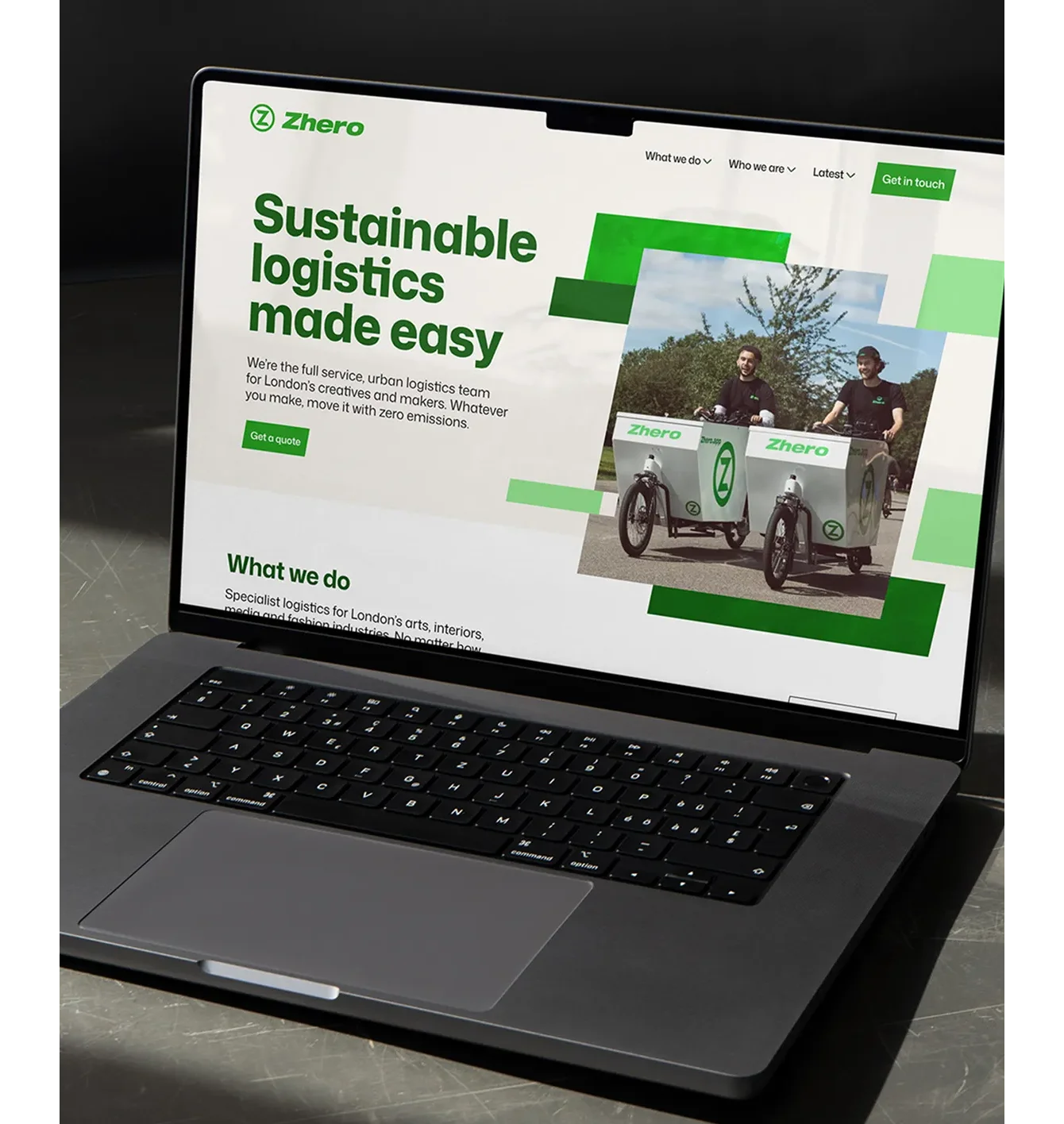
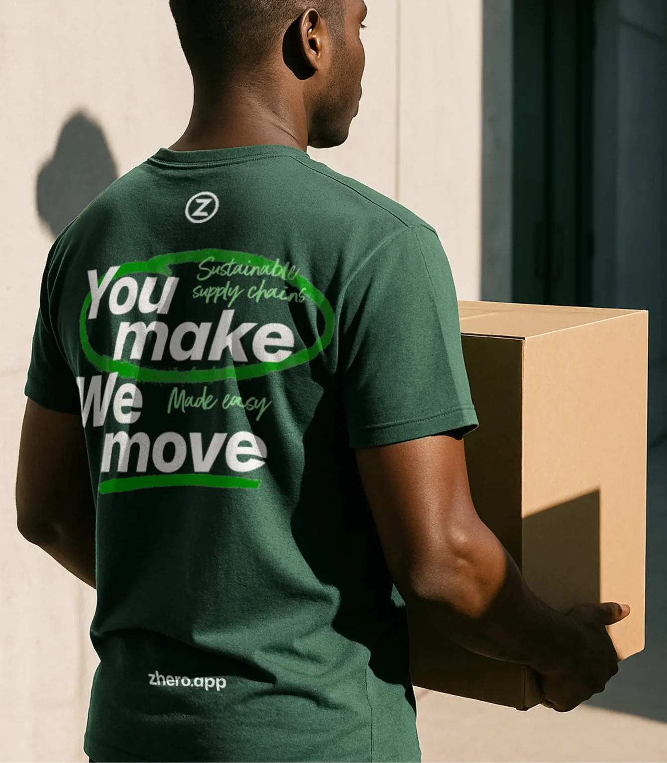
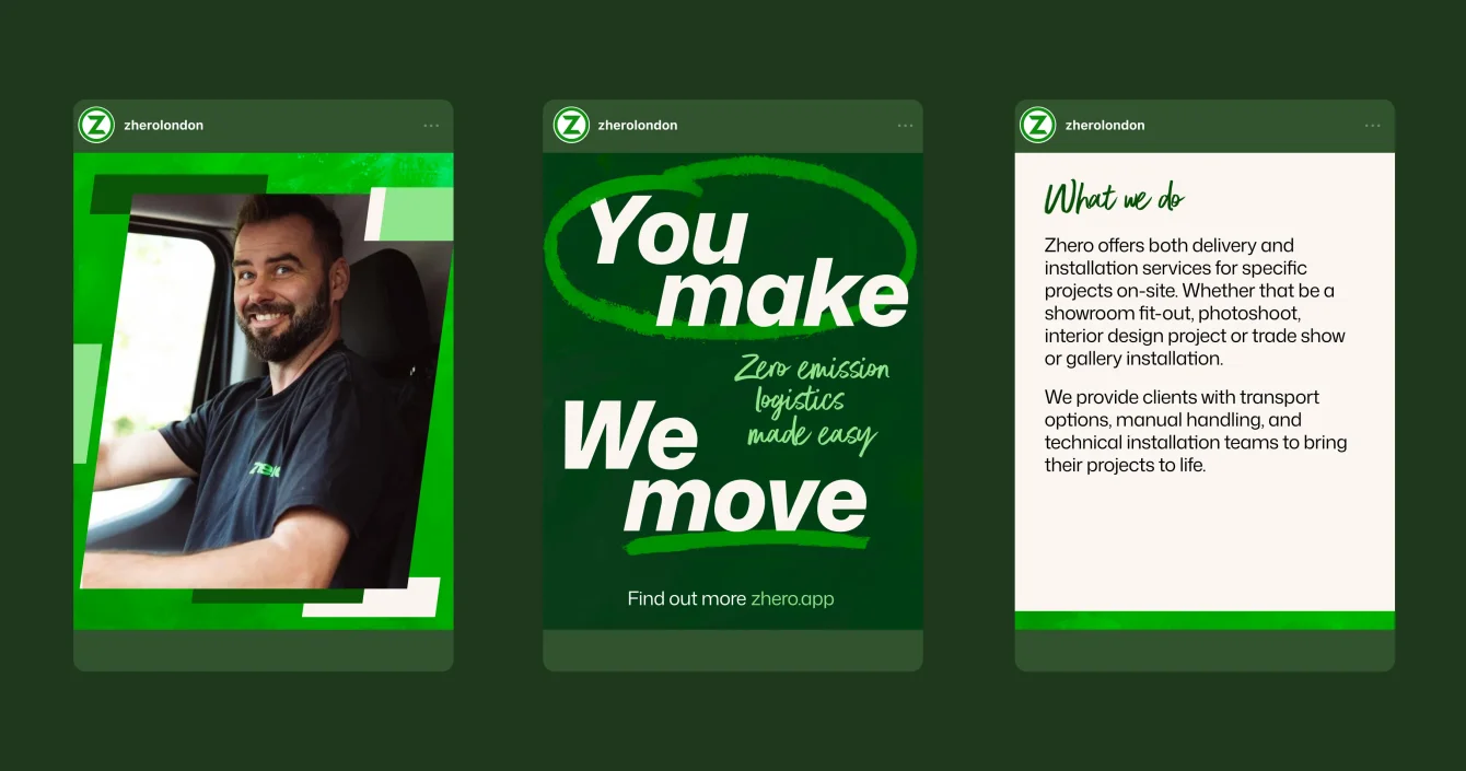
Beyond the logo, Zhero really didn’t have much of a visual language to speak of. Our goal was to build a full visual toolkit that the team could use to express themselves consistently, without relying on the logo alone. At the same time, we wanted to give Zhero the flexibility to adapt their tone for different audiences and communications.

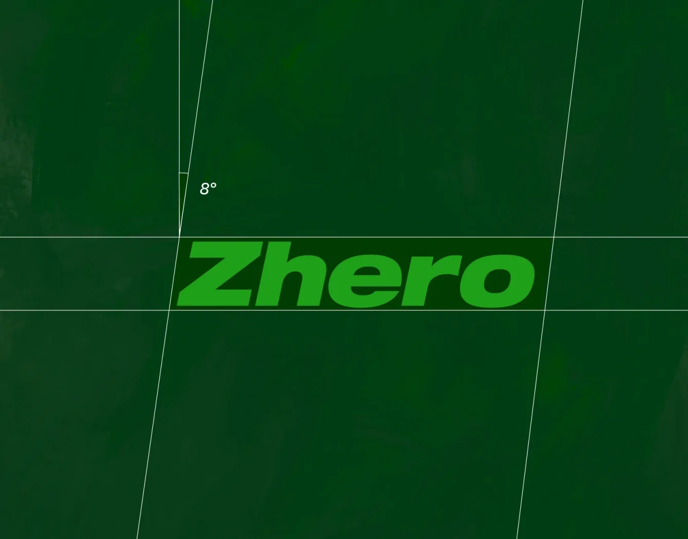
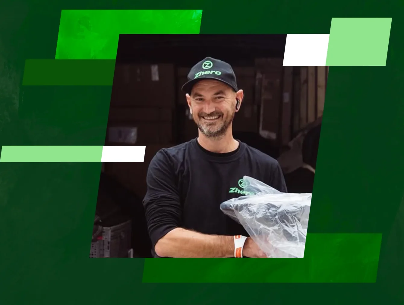
Taking inspiration from the 8-degree slant of the logo, we developed a slanted grid system that ties designs together visually and gives every application a sense of motion.

zhero-casestudy-03_min.webp
zhero-angles_min.webp
zhero-presentation_min.webp
zhero-laptop_min.webp
zhero-tshirt_min.webp
zhero-merch_min.webp
zhero-social_min.webp
Zhero-Thumb-020_min.webp

Brand stewardship

Intuitive and interactive brand guidelines

We built an interactive brand guidelines website that became the home of Zhero's brand strategy identity and assets. This gives the Zhero team and collaborators an intuitive, practical way to access everything they need to create confident, day-to-day communications.


Up next

An accessible mobility movement

Identity, Digital and Motion for Not A Wheelchair